
So here I am posting this cause I know some of us at LT were having the same problem! So read on if color management drives you up the wall, if not, please proceed throughout your day. :)
My problem was not having consistent colors in Photoshop, web browsers, and in prints! In an ideal world, it would match perfectly but the harsh reality is that that's close to impossible.
First thing first.. Web images. Everyone's color setting may be different but mine was set to Adobe RGB (1998) in both photoshop and in camera (I read somewhere that, that was the best color setting for prints, please correct me if I'm wrong..) So when I edit photos in that color setting, and I "save as web", the colors were really desaturated. The problem was this! Apparently most browsers can not read Adobe RGB (1998) color profile(except for the safari browsers) which threw off the colors! By just a simple click of converting the profile, the original colors were maintained! :)
In photoshop, go to edit>convert to profile> select sRGB IEC61966-2.1
I'm a happy gal now..
Here's an examples. Notice the difference? (Note that if you are on Safari browser, these images may looks exactly the same due to the fact that Safari supports Abobe RGB 1998 profile)
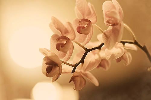 Before converting the color profile: Adobe RGB (1998)
 After converting the color profile: sRGB IEC61966-2.1
Now onto printing.. This one is a bit more difficult and you'll have to go through trial+error to get it right since everyone's printer (known as output device in the article) is different, but for me, I found Print workflow 2 to be most accurate. To get started, I found this article very useful, hope you do too! :)
In other news.. My camera is still in the shop and I'm going fishing with the bf & some friends for the first time and I don't have a camera to document it. :(
ETA: If you're a MAC user, running on a Safari browser, using Adobe RGB (1998) color profile, and the above images looks the same to you, you may still want to convert the color profile because rest of the world who are not on a Safari browser is probably not seeing the colors you are seeing.. But of course, that's only if that matters to you.. :)


1 comment:
ha ha.. you're funny. I am a MAC and Safari user.. and these images do look different. .. the 2nd one is desaturated.. is that what it's supposed to be?? I'd love to learn more about this. I know when I save my pics and post them on my blog they don't look the same.. they looks their punch.. and I have no idea why. Color management could obviously be part of the problem. Thanks for the info!.. I loved reading this post.
Post a Comment